 |
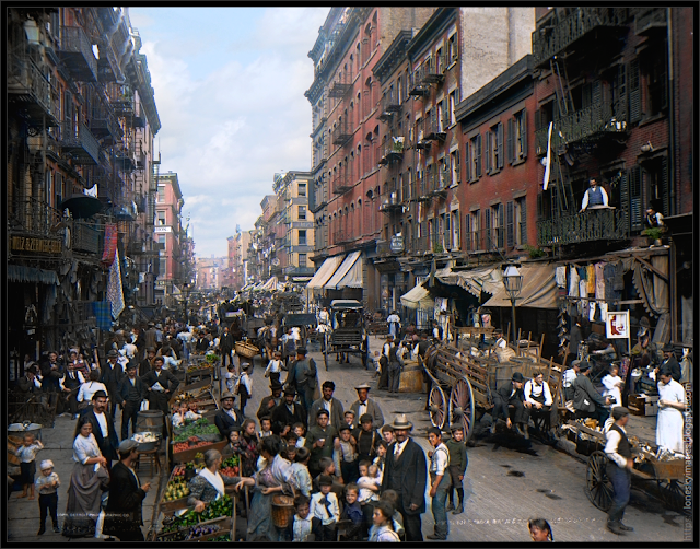
| Mulberry St., New York, N.Y. courtesy Library of Congress. |
How naive I was. The results in this low resolution proof-of-concept, though more convincing than other colorized Mulberry Street examples I've seen, fall far short. The best I can say is that some parts of it look like old Kodachrome film.
 |
| Mulberry Street colorized by LoneSky. |
I knew it would be tedious due to the astonishing amount of detail present in the image. I was not prepared for how difficult it would be to give it a convincingly modern look.
The problem—one of the many difficulties of colorizing old photographs—is with the characteristic tone response of the original medium. Before 1906, commercial film was sensitive to just shorter wavelength light—blue and green. It even recorded some of the ultraviolet spectrum. This orthochromatic film, as it was known, was insensitive to yellow, orange, and red. So fully half of the visible spectrum shows an incongruous grayscale tone.
Depending on the subject matter, this could drastically skew the apparent darkness or lightness of colors. Vivid red objects would appear very dark, for example, while blue objects would render as light gray or even white. The term for this is orthochromasia and the effect is clearly visible in the Union Jack in this photo:
 |
| Orthochromasia example, via Wikimedia Commons. |
The reason old photos rarely show much sky detail is because this oversensitivity to blue and ultraviolet light, relative to other colors, would inevitably result in overexposure.
Very few things in nature are spectrally pure, however, so even predominantly red objects would still usually show some detail.
CHOOSING THE RIGHT COLORS
So how does one determine what colors to use? Some things are fairly straightforward with a little bit of research. Many of the buildings in this block of Mulberry Street still exist today, with varying degrees of modification, as can be seen on Google Street View here:
 |
| 78 Mulberry Street in 2019, via Google Maps. |
A closer inspection shows which buildings have been painted, though most of these painted structures remain roughly brick red.
The most obvious change for the properties that still remain is the three story building at 84 Mulberry Street. Among other things, its facade is now white, probably glazed brick, and the decorative cornice is gone.
Without the cornice and first floor store front facade, many of these types of buildings are little more than plain and artless boxes. The living conditions in the tenements at the turn of the century were often bleak, but the outside appearance of many of the buildings had an aesthetic quality sorely absent compared their current aimless stripped-down utilitarianism. This was because the earliest tenements were repurposed single-family dwellings originally built and occupied by the wealthy while the later purpose-built tenements were decorated to reflect the Gilded Age aspirations of their immigrant communities.
Getting back to orthochromasia, the gray tone of the red bricks in the Riis photo is significantly darker than in modern photos so even if I match the hue exactly it will not look the same without further extensive editing.
Another example of the problem of orthochromasia is with the produce in the vendor carts. Most of it can be clearly identified:
 |
| Detail: Mulberry Street produce carts. |
Starting from the upper left in this full-resolution and cleaned up detail I see onions, green beans, possibly plum tomatoes (though the gray tone suggests they are still green), bell peppers (the dark tone suggests red), pears, and possibly eggplants.
When I tried to colorize the pears and bell peppers chartreuse and scarlet, respectively, they did not look correct. I'm fairly certain those are pears and I wanted them to look right so I ended up selectively lightening them for the colorization.
The pears remind me of the scene from The Godfather: Part II where Vito Corleone, after losing his job, brings home a pear to his wife. Her response to this simple gesture is charming and humbling. How many of us today would find such joy?
The bell peppers looked more natural when colored green so I did that instead of lightening them and making them red. What I assume are green tomatoes look fine colored red so I went with that.
It's little judgment calls like these that colorists have to make. It's simply impossible to know with certitude what color many non-permanent items are—like clothing—and even when we do know, as with the produce, sometimes it just looks better or is easier to color them differently.
CONFORMING TO STEREOTYPES
So what happens when we get those judgment calls wrong? In popular media, people in the 1900s are usually shown wearing mostly muted attire with splashes of color here and there, though women often dressed more colorfully. This appears to be mostly a working class neighborhood so I used a subdued, restrained palette.
 |
| Closeup detail of onlookers from an earlier, incomplete version of the colorization. |
Why? Because that is the popular conception. This attitude is actually an issue some historians have with colorization.
For a really good demonstration of the pitfalls of colorizing old photos, particularly by computer algorithm, scroll through the slides in this Reddit post. I can say with honest humility that I never would have gotten the vibrant colors of those clothes and buildings correct either!
As a side note to the above image, I've discovered that coloring faces at this small scale is a lot more difficult than with larger faces. I often have to edit at the individual pixel level because faces have subtle hue and saturation variation, especially around the eyes, and there are not a lot of pixels to work with. Colors that look correct on lighter parts of the skin readily oversaturate on darker parts. You have to constantly change your brush color just to color a few pixels. I suspect that orthochromasia is also making the men's faces darker than they should appear as well, though laborers were usually very tan to begin with.
ADDING A SKY?
The original Jacob Riis photo has almost no sky detail in it. When I started this project I had no intention of adding a sky. Yet no matter what I did, if I left the sky milky white, the result looked off. I couldn't put my finger on exactly why. Maybe I just don't like hazy white skies as in the photo below?
 |
| The Feast of San Gennaro on a light overcast day. Daniel Schwen, via Wikimedia Commons. |
Look again at either the original or the colorized version. Neither look like they are bathed in bright afternoon sunlight. Yet we know it's afternoon because of the direction of the shadows and the children out from school holding their school notebooks. We can speculate that it's also fairly bright by the way some in the foreground are squinting. There are also unmistakably clear and sharp shadows in the sunlit right side, though not very deep, and the buildings on and past Canal Street are well lit so it is not too overcast either.
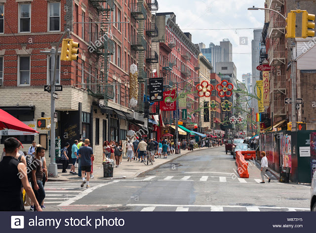
So what could account for this discrepancy? Why does the original photo look so dim? Maybe the photographic plate Riis used, or even the scanner used by the Library of Congress, produced low-contrast imagery. Perhaps the edge of a cloud shadow was passing by. I don't know. If I had to guess I think the photo shown below has about the same atmospheric conditions as on that day:
 |
| Common sky conditions on a warm day. Michael Brooks / Alamy Stock Photo. |
Perhaps I will insert a similar sky if I ever get around to finishing colorizing the full-resolution image but the current sky is not too much different and it looks plausible enough. Thin cirrostratus could produce a nearly featureless sky and distinct shadows too.
I think it's safe to say that the apparent dynamic range compression of the original image almost precludes it ever having a modern digital photo look. Digital cameras today have been highly refined to record tonality (and color) in a way that looks closer to how we percieve it compared to photographic plates from the 1900s.
One thing I would like to preserve are the numerous wires suspended above the street, as seen in this enhanced detail:
 |
| Detail: Telephone and electric cables over Mulberry Street. |
At first I thought they were scratches on the glass plate, but they all seemed to possess a catenary curve that looked like cable sag. Suspicious, I did a little investigating and, sure enough, I found contemporary accounts of these wires.
 |
| A 1880s postcard showing overhead wires, via Ephemeral New York. |
The more you know about your subject the better equipped you will be to make a credible colorization.
SIMULATING COLOR RADIOSITY
Another complication, one that still vexes me, is trying to reproduce the complex bounced colored lighting of the scene.
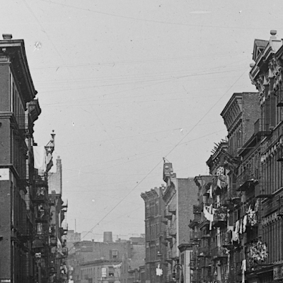
On close examination it is apparent that the entire left side of the street is in shadow from the buildings. In another photo of the same block taken a few years later, with remarkably similar shadows, we can see just how much of the street is in shade around this time of the day:
 |
| Afternoon shadows on Mulberry Street in 1905, via Shorpy. |
(Also note the compressed tonality between shadow and light.)
In the Riis photo the group of people in the foreground straddle the shadow demarcation, with the bambino in front of the wheel of the cart standing in direct sunlight and casting a distinct shadow. As one moves further to the left the people look gradually and increasingly enveloped in diffuse shadow. That means the predominant source of illumination would be cool sky light and warm reflected light from the right side of the street.
I tried to simulate these two different lights, most noticeably on the woman and two children in the lower left of the image. Notice how the sides of their bodies facing towards the right side of the street are warmer in color. Other people show varying degrees of similar coloration.
To sum up, there are a lot of considerations that should be accounted for if you want to make reasonably realistic colorizations of complex scenery. I hope this post will be of some use to people interested in the subject.
This work is licensed under a Creative Commons Attribution-ShareAlike 4.0 International License.


Comments
Post a Comment